Mission-First Leadership: How Dr. Dondi Costin Anchors Liberty University in Faith
Discover how mission-first leadership helps institutions stay faithful to their calling, inspire teams, and avoid drifting from their core mission.
Featured
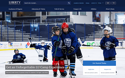
Just as the first impression others have of you rests on the way you present yourself—with your handshake, your smile, and the first words out of your mouth—your higher ed homepage offers a first impression of your institution for potential students.
It was Will Rogers who said, “You never get a second chance to make a first impression.”
With all the educational choices available to students these days, it’s hard to get a second chance with them. That’s why your higher ed homepage explains who you are, and what you stand for in a compelling way.
But, crafting an effective higher ed homepage requires understanding the elements that make it engaging, informative, and persuasive.
Compelling copy targeted towards your audience is helpful, but that alone won’t give us that “WOW” finish we need to attract students who align with our institution.
Let’s take a look at the seven key elements for an effective homepage, inclusive of common mistakes (and how to avoid them) so you can make a winning first impression.
Many institutions default to generic homepage headlines, such as “Welcome to [University Name]”, or simply state their motto. While these may be welcoming, they often fail to capture the unique value proposition of the institution.
These generic headlines do not grab the attention of prospective students or convey what sets the institution apart from others.
They lack the specificity and engagement needed to make a strong first impression.
Your headline should clearly articulate the key benefits and unique aspects of your institution.
For example, “Unlock Your Potential with [University Name]’s Innovative Programs” immediately communicates value.
It should be concise, engaging, and tailored to highlight what makes your institution special. By using a compelling headline, you can immediately draw in visitors and pique their interest.
Some websites feature overly complicated navigation menus with too many options or poorly organized categories.
This will likely overwhelm visitors and make it difficult to find the information they’re looking for.
Because users become frustrated, they will navigate away quickly, leading to high bounce rates as they struggle to find answers to their questions.
To fix this, implement a simple, intuitive navigation structure.
Organize menu items logically with clear, descriptive labels. Be sure to incorporate a search bar to help users find specific information quickly.
Categories like “Admissions,” “Academics,” “Student Life,” and “About” can guide users efficiently through your site.
By creating an intuitive navigation system, you will ensure visitors can easily access the information they seek, which will enhance their overall experience.
Outdated designs, inconsistent branding, and cluttered layouts are common issues with many academic websites.
I get it, it’s hard to find the time to keep your website updated.
But, these problems detract from the professionalism and credibility of your institution’s site.
A visually unappealing or inconsistent website can harm the institution’s credibility and fail to engage visitors effectively.
I recommend adopting a clean, modern design that aligns with your institution’s brand identity.
Maintain consistency in color schemes, fonts, and imagery, and use high-quality images of campus life, events, and facilities to create a visually appealing and cohesive look.
A visually consistent and attractive higher ed homepage can significantly enhance the user experience and leave a lasting impression.
Websites often feature long blocks of text that are not engaging or relevant to prospective students.
I know there is a LOT you want to share with your potential students, but lengthy, unengaging content can cause visitors to leave the site without taking any action, reducing the effectiveness of the homepage.
Instead, create concise, engaging content that directly addresses the needs and interests of prospective students.
Use headings, subheadings, and bullet points to organize information clearly, and incorporate multimedia elements like videos and infographics to make the content more dynamic and engaging.
The text for these things should be short and concise, with links to other pages for more information should the reader need it.
You can also highlight key aspects such as program offerings, campus life, and student testimonials.
By making the content concise and relevant, it will become more engaging and will better retain the interest of your visitors.
Remember, to consider how SEO is developing with new AI tools into a new kind of SEO called GEO!
Some websites lack clear CTAs or bury them at the bottom of the page, making it difficult for visitors to know what steps to take next.
Without clear CTAs, visitors may not know what actions to take. Especially those who are just starting on their education journey!
Unfortunately, this is a common mistake that leads to missed opportunities for engagement and conversion.
To fix this, place prominent, clear CTAs throughout the homepage.
Examples include “Apply Now,” “Request More Information,” “Schedule a Campus Visit,” or “Subscribe to Our Newsletter.”
These CTAs should stand out visually and provide a straightforward path for visitors to follow.
If you ever wonder if you should add a CTA or not, remember: effective CTAs guide visitors through the desired actions.
If there is an action you want the visitor to take, make it prominent! Doing so will increase the likelihood of engagement and conversion.
When potential students see testimonials, reviews, or accreditation badges on your website, they have a deeper trust for your institution.
Yet, many academic sites don’t display these prominently on the front page.
Lack of trust signals can make it difficult for visitors to feel confident in the institution, and will likely reduce the likelihood of engagement and conversion.
I recommend displaying items such as testimonials from current students or alumni prominently on your home page.
A slider section titled, “Hear from Our Students” filled with testimonials that are relevant to your mission-fit student will reassure visitors they are in the right place.
Students in the Millennial, Gen-Z, and Gen-Alpha generations are more likely to look up a website on their phone, than on their computer.
But when a website is not optimized for mobile devices, this experience quickly becomes frustrating. Remember what we said about making a good first impression?
A mobile-friendly website ensures that anyone visiting your site can access information quickly and easily, no matter what device they’re using.
This ease of access will help keep potential students engaged and encourage them to take the next steps—whether that’s filling out a form, scheduling a campus visit, or applying to your institution.
To ensure your website meets these expectations, collaborate with your web team to emphasize user-friendly navigation, quick loading times, and designs that work seamlessly on any device.
The easier it is for users to find what they’re looking for on their phones, the more likely they are to stay on your site and engage with your content.
You could even consider creating an app for your institution!
Remember, a mobile-responsive design ensures that all visitors, regardless of the device they use, have a positive experience on your site.
These days, a higher ed homepage that resonates with your mission-fit students is the best way to make a good first impression in the digital world, and drive your audience to action.
Ready to take your higher education homepage to the next level? Let’s chat!
We can help you strategize a website that resonates so you can stand out among the many options available to potential students.
The essential marketing book every higher education institution needs! If you are a higher education marketing professional seeking a fail-safe plan to make your institution stand out, “Chasing Mission Fit” is your guide.
 Discover how to:
So you can empower your institution with audience-focused marketing strategies, and attract mission-fit students who will flourish in your unique academic environment.
Ready to transform your institution’s marketing approach?
Order now!
Featured image by NDABCREATIVITY via Adobe Stock
Subscribe to The Higher Ed Marketer podcast today!
Discover how mission-first leadership helps institutions stay faithful to their calling, inspire teams, and avoid drifting from their core mission.

Explore how AI-driven chatbots enhance authentic student engagement without losing your human touch.

There are many non-traditional approaches to education which can attract your mission-fit student, and you’ll find several benefits for your university by embracing them!