Why Higher Ed Leaders Must “Know What They Don’t Know” About Marketing
Higher ed leadership marketing doesn’t require expertise in every tactic—but it does require asking the right questions.
Blog
As you think through the most effective communication strategy for your school to attract students, guide them through the admission process and retain them, could mobile apps help?
Whether yours is an independent K-12 school or higher ed institution, if you have an app or considered developing one, it’s likely for a very specific purpose.
Usually, a communication tool for existing students and their families is used to push out routine or emergency notifications throughout the school year, or remind students to re-enroll.
But mobile apps can be a highly valuable part of your enrollment marketing plan, too.
It’s all about creating a communications ecosystem in which you provide a curated, mobile-centric experience for your prospects, applicants and enrolled students.
The challenge for any enrollment marketer is to introduce the institution to prospects in an authentic way – to deliver a brand promise – and then keep that promise with a consistent experience.
I’m not just talking about the potential for disconnect between flashy marketing materials that paint one picture and a website that paints another, though that can be part of the problem.
Our focus in this article is on user experience. The disconnect in pre- and post-enrollment experience may not be in the messaging, but in the online environment.
Have you ever:
What these examples represent is a lack of a consistent, mobile-centric ecosystem mentality.
Poor continuity of user experience is the problem.
Marketing teams often put a lot of attention on external communications, crafting messaging that is both compelling and authentic as possible.
But those external comms usher prospects into a reality that might feel so different from the first impression, they may wonder whether they’re in the right place.
The opposite may be true.
Sometimes, the experience enrolled students get through a well-designed mobile app and/or mobile-centric communications doesn’t extend to prospects.
Mobile apps, as part of your digital ecosystem, can be part of the solution.
Many mobile apps for educational institutions are strictly tools for communication with users who are already part of your community, e.g. existing students and families.
They solve a certain set of problems specific to this group:
For example:
In both cases, it appears the app was developed primarily for the traditional purpose: to enhance the user experience for enrolled students, their parents or athletic spectators. Tools for existing members of a community, not prospective members.
However, when you look deeper, you’ll see a key difference between these two examples.
One is part of a mobile-centric digital ecosystem that has the entire student lifecycle in mind. The other is not.
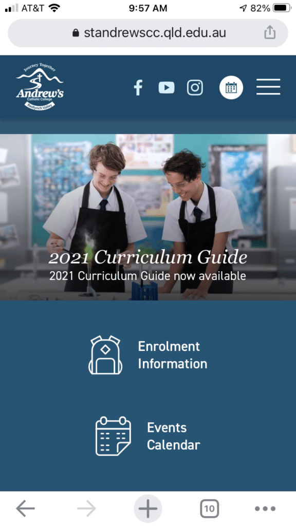
When I go to St. Andrews’ website on my iPhone, I see a mobile-responsive site that looks a lot like the AndIE App screenshots.

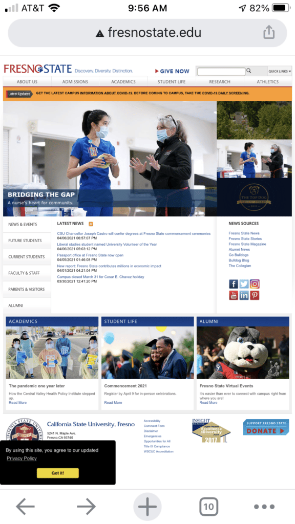
Fresno State, on the other hand, looks like this:

As someone outside these communities, a possible prospect, I suspect I’m getting a taste of what communication with the school will feel like should I choose to enroll myself or my child.
One is clear, streamlined, built around my mobile device preferences.
The other is busy, cluttered, built around everything the institution wants to convey to me.
I suspect the reason for this is simple. St. Andrews worked with a vendor, Digistorm (more about them below) that understands mobile apps don’t work best in a vacuum. They should be part of a mobile ecosystem.
Building that ecosystem could start with mobile-friendly website design (geared toward external comms), but it doesn’t always happen that way. Sometimes it starts with inspiration from a simple, well-designed app (usually a portal for internal comms).
If you’re currently using a mobile app for a gated community purpose like the examples above, what if you could build out that ecosystem for enrollment marketing purposes?
For institutions that have seen the benefits of mobile apps for internal comms, here’s the central question: If this is an effective means of capturing your community’s attention, why wait until enrollment to introduce them to aspects of the experience?
The most basic example of this is what I mentioned above. A mobile-friendly website geared toward prospects, but with a similar clean look, easy navigation, speed and responsiveness of the app your enrolled students use, is a no-brainer.
Beyond that, a healthy mobile ecosystem is one that integrates as many functions of effective external and internal communications as possible.
To determine whether you have such an ecosystem in place, consider these questions:
These examples of a disconnect in the external vs. internal user experience are very common. Often separate teams or departments select the tools, build the comm flows and run the messaging separately.
But when comms come into alignment around a mobile-centric ecosystem, it opens doors to utilizing a mobile approach earlier in the student lifecycle, enticing them with the quality of your mobile ecosystem well before they’ve enrolled.
The utility of mobile apps for educational institutions don’t have to be limited to closed communities and internal comms.
In many circumstances, you can motivate external audiences to download your apps, get onboard your comm flow and start enjoying your mobile ecosystem.
Here are a few examples.
With this app, prospective families have everything they need to take a self-guided tour of campus. It includes a built-in map that tracks the user with GPS, information about campus visit events, campus life information, etc. Everything they need to know to become an Oregon Duck.
This is a great example of an app designed for prospects and enrolled students alike, as it has both internal modules, e.g. View My Grades and View My Test Scores, and indoor maps, videos, academics and financial aid information included to aid the decision-making process.
This app includes an events module called This Week @ Georgetown with inclusion of prospects and current students in mind. It includes information about everything happening on campus, such as campus tour days, and engaging stories about community members.
Not surprisingly, these institutions all have mobile-responsive websites as well.
That’s because they understand their mobile apps to be more than communication tools for the campus community, but part of their overall approach to modern, mobile-centric communications.
That approach works best when comms are aligned to serve all audiences consistently, on campus and off. And having a single ecosystem as a foundation for it all has the added benefit of being easier for you, the enrollment marketer, to utilize.
As you build a mobile ecosystem, you open the door to managing all comms in a mobile-centric, user-friendly way more easily and consistently.
The key is integration. The more you run through a single mobile-friendly platform – your content marketing, event promotions, calendars, enrollment funnel system, etc. – the more you can automate and simplify your comms. And it may make sense to start with a mobile app.
As I mentioned above, the app for St. Andrews was developed in partnership with Digistorm. I’m a fan of their approach, which really goes beyond single-purpose app development.
Instead, they create the kind of ecosystem I recommend, one that supports consistent, mobile-centric communication across the board:
Mobile apps are great, but if they’re not integrated with the tools you use to manage your website and enrollment funnels, you won’t get nearly as much out of them as you could.
Given the time and cost that comes with mobile app development, you definitely want to get the most out of yours!
Building a mobile-centric digital marketing strategy for 21st-century enrollment marketing is definitely a team effort.
My team and I not only partner with marketing departments for independent K-12 schools and higher ed institutions, we often bring in partners like Digistorm to create innovative strategies for next-level enrollment marketing.
If you’re interested in mobile apps for your school, let’s talk about that. But we may not want to stop there.
Let’s take a look at the overall health of your mobile ecosystem. Let’s make sure the environment is in place to ensure your new mobile app or other mobile-friendly tools will be effective at driving enrollment and retaining students.
Ready to start that conversation? Just reach out.
You’re in luck! We’ve curated 25 awesome ideas inspired by top higher ed institutions across the country and put them in one handy guide: 25 Ideas for Great Admissions Content.
 In this popular resource from Caylor Solutions, you’ll get…
Get inspired.
Get enrollment results.
Get 25 Ideas for Great Admissions Content.
Download your copy today!
Featured image by Alessandro Biascioli via Adobe Stock
Subscribe to The Higher Ed Marketer podcast today!